How WebP Images Reduced My Bandwidth Usage by 50%
Last year I migrated this website from Jekyll to Eleventy. This year, I’m finally implementing WebP images to save bandwidth and make this site even faster to load! This simple change reduced my bandwidth usage by 50% and is still backwards compatible with old devices and browsers.
Read more about my Jekyll to Eleventy migration here. I switched because I'm not a Ruby developer and that held back the development of this site.
WebP?
WebP is a "modern image format" that was developed by Google and released in 2010. The primary goal was to reduce file sizes. A lossless WebP image is on average 26% smaller compared to PNG. When you go lossy, images can be up to 34% smaller compared to JPG.
This is a great way for websites to save bandwidth while still serving high-quality images to visitors. And since 2021, it's widely supported after Safari finally joined the party.
Possibilities of implementing WebP
There are three ways in which WebP images can be served to visitors, while still providing a fallback for browsers that don't support it:
- Server-side content negotiation (Accept headers)
- Using JavaScript to detect support for WebP and rewrite
<img>tags - Using the HTML5
<picture>element
I went with option 3 because it's well supported and doesn't need tinkering with server configurations or additional scripts on my website.
The picture element
The idea behind the picture element is really simple: take a regular <img>, wrap it in a <picture> tag and then define different versions with <source> tags.
For instance, you can embed a JPG image and offer WebP as an alternate version:
<picture>
	<source srcset="image.webp" type="image/webp">
	<img src="image.jpg" alt="" loading="lazy" width="1500" height="1128">
</picture>
In the example above, the browse will evaluate each <source> element and determine which is best to load. It will favor the WebP version if the machine supports it. If a browser doesn't support the picture element or any of the sources, it'll fallback to the regular <img> tag.
You can also use the picture element for responsive images, where you serve smaller images to mobile users in order to save bandwidth. Or to serve higher quality images to visitors with High-DPI screens:
<picture>
  <source srcset="logo-480.png, logo-480-2x.png 2x">
  <img src="logo.png">
</picture>
Side note: all the attributes defined on the <img> element will be applied regardless of the source that is being displayed.
Converting images
With the implementation strategy decided, I wrote a script (Typescript) that converts all JPGs and PNGs to WebP. It uses Sharp to do the conversion, which is blazing fast!
import { fileExists } from "../helpers/fileExists";
import sharp from "sharp";
import fg from "fast-glob";

/**
 * Finds all images that match the input glob pattern and convert them to WebP
 * without resizing.
 * Skips files that already have a WebP version (same filename, different ext).
 */
async function generate_webp_versions(globPattern: string[]){
    const files = await fg(globPattern);
    for(const masterPath of files){
        const webpPath = masterPath.substring(0, masterPath.length-3) + "webp";

        if(await fileExists(webpPath) !== false){
            continue;
        }

        const originalExtension = masterPath.substring(masterPath.length-3);
        if(originalExtension !== "png" && originalExtension !== "jpg"){
            throw new Error("Unknown image format!");
        }

        let sharpOptions: sharp.WebpOptions = {};
        if(originalExtension === "png"){
            sharpOptions = {
                quality: 60,
                nearLossless: true,
            }
        }else if(originalExtension === "jpg"){
            sharpOptions = {
                quality: 70,
                lossless: false,
            }
        }

        console.log('Generating:', webpPath);
        await sharp(masterPath)
            .toFormat("webp", sharpOptions)
            .toFile(webpPath);
    }
}

console.log("Generating WebP versions...");
await generate_webp_versions([
   "src/site/uploads/**/*.(jpg|png)",
   "src/site/assets/**/*.(jpg|png)",
   "src/site/courses/**/*.(jpg|png)",
]);
The compression settings depend on the file format:
- JPGs: lossy, quality level 70
- PNGs: near lossless, quality level 60 (somewhat counter-intuitive to set a quality level when using "near lossless")
I checked the differences between the original images and their WebP counterparts. I honestly couldn't tell the difference in quality. But I could tell the difference in file size (more on that later).
Eleventy: wrapping images in picture elements
With all the WebP versions created, it was time to wrap all <img> tags into <picture> tags. This blog is powered by Eleventy which uses markdown-it to convert my posts into HTML.
So this Markdown snippet:
Turns into:
<img src="/uploads/my-image.png" alt="This is my image">To change this, I created a custom markdown-it plugin that overwrites the image renderer:
'use strict';

const {statSync} = require("fs");

function fileExists(pathName){
    // The try-catch here is for Cloudflare Pages, which runs on
    // Nodejs v12, and doesn't have the "throwIfNoEntry" option
    try{
        return statSync(pathName, {throwIfNoEntry: false});
    }catch(e){
        return undefined;
    }
}

/**
 * This is a modified version of markdown-it-image-lazy-loading
 * I've adapted it to return a <picture> when a webp version of
 * an image exists on disk.
 */
module.exports = function lazy_loading_plugin(md, mdOptions) {
  var defaultImageRenderer = md.renderer.rules.image;

  md.renderer.rules.image = function (tokens, idx, options, env, self) {
    var token = tokens[idx];
    token.attrSet('loading', 'lazy');

    if(!mdOptions || !mdOptions.base_path){
        throw new Error("base_path was not provided");
    }

    const sizeOf = require('image-size');
    const path = require('path');

    const imgSrc = token.attrGet('src');
    const imgPath = path.join(mdOptions.base_path, imgSrc);
    const dimensions = sizeOf(imgPath);

    token.attrSet('width', dimensions.width);
    token.attrSet('height', dimensions.height);

    // Check if the webP version exists
    const webpPath = imgPath.substring(0, imgPath.length - 3) + 'webp';
    const defaultRender = defaultImageRenderer(tokens, idx, options, env, self);

    if(fileExists(webpPath) !== undefined){
        return `
            <picture loading="lazy" width="${dimensions.width}" height="${dimensions.height}">
                <source srcset="${imgSrc.substring(0, imgSrc.length - 3) + "webp"}" type="image/webp">
                ${defaultRender}
            </picture>
        `;
    }

    return defaultRender;
  };
};
It takes the output of the default renderer (the single <img> tag) and wraps it inside a <picture> element if the WebP version exists on disk. It also adds the width and height of the image to prevent cumulative layout shifts.
I then created a custom instance of markdown-it with this plugin enabled, and set it as the default Markdown library in my Eleventy configuration:
const markdownLib = markdownIt(markdownOptions)
        // Lazy load images and serve WebP versions using the <picture> tag
        .use(require('./src/utils/markdown-it-xd-images'), {
            base_path: __dirname + '/src/site',
        });

// Tell Eleventy to use my instance of markdown-it
config.setLibrary("md", markdownLib);
That's it! My website now supports WebP images.
Average file size: WebP vs JPG and PNG
But how much smaller are WebP images? Well, a lot! Here's the average JPG and PNG size compared to WebP:
Average size of JPG and PNG images when they're converted to WebP.
JPG files are on average 71% smaller when converted to WebP, while PNG files are "only" 45% smaller. That's very impressive!
This seems like magic, but take it with a grain of salt. These are averages and some of my original images weren't properly compressed or optimized to begin with.
Effects on bandwidth
Smaller files also mean less bandwidth. This website is hosted on Cloudflare Pages, which means I can easily see how much bandwidth it consumes.
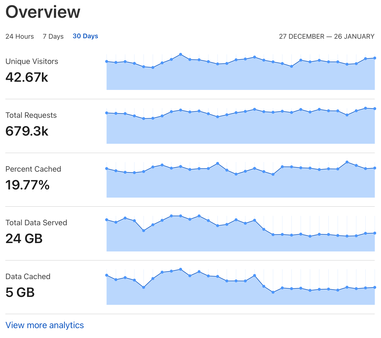
Here's the bandwidth graph, and you can clearly see when I deployed the WebP images:

Here's a more detailed graph with the raw data:
This site went from consuming about 1GB of bandwidth per day to half that. Even though I don't have to pay for traffic, it's still a great result! Smaller files mean webpages load faster, especially if a visitor has a crappy connection.
Source code
The source code of this website is still available on GitHub. Check it out if you want more details.

