Preventing Cumulative Layout Shifts with lazy loaded images (Eleventy + markdown-it)
There's nothing more annoying than a website shifting down just as you're about to click on a button or link. This is called a layout shift, and Google has declared war on them. They've added layout shifts to the Core Web Vitals, and if your website has a lot of them, it will get penalized in the search results.
Here's how to prevent (lazy loaded) images from triggering layout shifts.
What's a layout shift?
Just to make it clear, here's what a layout shift looks like:

Browsers try to render web pages as soon as possible, and sometimes they start displaying content before all images have been downloaded. Then, as soon as the image does finish loading, the browser needs to make room for it and shifts the entire content down.
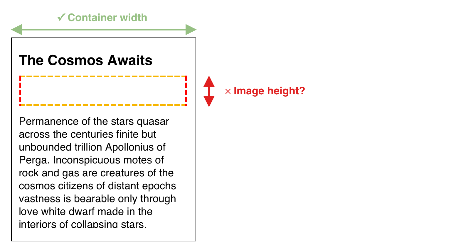
The problem is not a slow-loading image. It's that the browser doesn't know how much space it has to reserve for that image. So it reserves no space at all, which results in a layout shift when it finally finished downloading.

Modern web development
This is partly to blame on modern and responsive web development. For websites to work on various screen sizes, we stopped giving our images a width and height attribute. Instead, we use CSS like this:
img {
   max-width: 100%;
}
This tells the browser that no image can be wider than its container. Preventing horizontal scrolling and results in a better mobile experience.
But that doesn't tell the browser anything about the image dimensions. The height of the image is unknown, so the browser cannot reserve vertical space for it. Also, the image width is uncertain as well. An image can be smaller, bigger, or equal to the container's width.
Fixing this is easy: add a width and height attribute to your images. Like in the good old days!
<img src="/my-image.jpg" width="800" height="600">Now that the browser knows the image's dimensions, it can reserve the correct amount of space before the image is even loaded.
Fitting an image of 800x600 into a container that's 700px wide is not possible. It has to be scaled. And now, the browser can calculate the height of the scaled image before it has been downloaded.
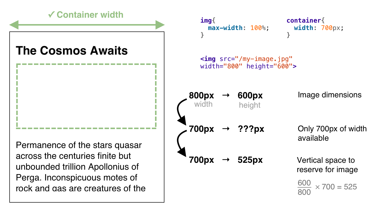
Boom! The browser knows it should reserve 525 pixels to accommodate the image. The page is rendered out, so you can start reading or interacting with it. When the images finish downloading, they are put in the correct placeholders without shifting the layout.
This excellent post from Barry Pollard gives a more in-depth explanation about the width and height attributes and how modern browsers use them.
How to implement it in Eleventy
Manually adding width and height attributes to all your images is not a fun task. Here's how I automate it with Eleventy (static site generator).
I use the markdown-it-image-lazy-load plugin to make sure that all images in my posts are lazy loaded by adding the loading attribute:
<img src="/logo.png" loading="lazy">Because lazy loading causes layout shifts, I decided to contribute to the plugin and add an image_size option that automatically fetches and inserts the dimensions of an image.
You enable it like this:
const markdownLib = markdownIt(markdownOptions)
        // Lazy load all images by default (browser support needed)
        .use(require('markdown-it-image-lazy-load'), {
            image_size: true,
            base_path: __dirname + 'src/',
        });

eleventyConfig.setLibrary("md", markdownLib);
Make sure to set the base_path correctly. In my case, the source code of my site is stored in the src/ directory.
Re-generate your website, and now all images should have a loading attribute and an explicit width and height.
It uses image-size behind the scenes to extract dimensions from the first few bytes of the image. In my case, it barely has any impact on build performance.
Effect of Lazy Loading
Implementing lazy loading can save you some bandwidth. In my case, I saw a reduction of about 30%.
This site went from consuming 700-800MB per day to 500-700MB per day. Not bad!
Conclusion
Let's give the width and height attributes some love. They help the browser, they provide a better user experience, and they'll give you a better position on Google ;)

